
When Adam said he’d chosen Olympians for our fifteenth week, my first thought went to “Super Saturday”. It was exhilarating to watch Jessica Ennis-Hill, Greg Rutherford and Mo Farah all win Gold within 44 minutes of each other on Saturday, 4 August 2012, especially having watched Great Britain win Gold in rowing and cycling events earlier that day.
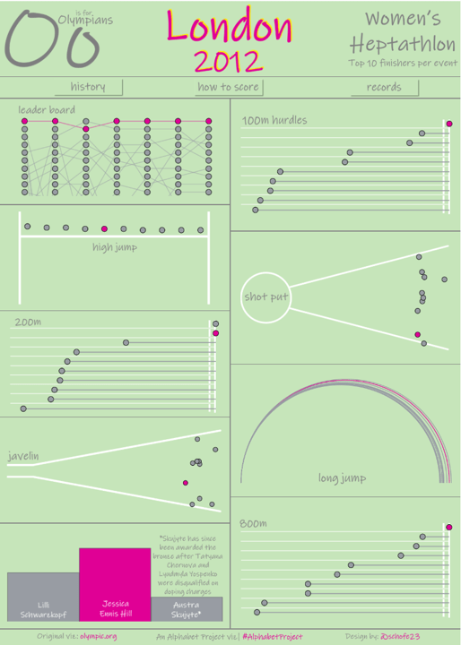
I’d watched all seven of Jess’ heptathlon events across the two days, but the scoring had baffled me. Jess broke her own record in the 100m hurdles and scored 1195 points, while Ivona Dadic scored 898 points for coming in last. It just didn’t make sense!
So I used this opportunity to dig into the points for each event and understand the calculations behind them. If you want to read more, click on the “how to score button” on my viz.
The Viz
I’ve always been firmly in camp “Tiled”, but have been experimenting with various floating vizzes lately. This viz is entirely floating and most of the text has been inserted as images to make the most of my favourite new font (yes I have a favourite font…don’t you?)
For this viz, I wanted to show each event separately, but soon realised it would get out of hand if I included all 38 athletes so I added a filter to only show the top 10 finishers per event.
The actual viz is then broken down into five different types of charts:
- Bump Chart
This chart uses a dual axis to show the circles and lines that make up the bump chart. I placed Event Number on columns to split the view into the seven events, then the Running Sum points onto rows twice. I made this a dual axis and synchronised the axes before changing one chart type to circle and the other to a line. I then right clicked on the circle axis and selected “Move marks to front” to make sure they appeared on top of the lines.
I then reversed my axis and changed the range to a Fixed start and Fixed end to only show the top 10. I didn’t want to filter the data on this, because I wanted to show lines dipping below and appearing from beyond tenth. This was important to give a cue that there were more than 10 athletes. Finally, I did some tidying up, hiding axes etc, and changed the colours to highlight Jess and leave all of the other athletes in grey.
2. Lollipop Chart
I mulled over how to show the running results for quite a while. I didn’t want to just have a short bar running left to right to show the winner, so Lorna Brown suggested a bar from right to left with a shorter bar showing better performance. This would work perfectly for the running events so I added a calc to show the time behind the winner and used this to create another dual axis chart. This time, I used a circle and a bar, making the bar thinner to look like a lollipop. I ordered the chart to show the fastest finisher at the top and added an image to look like the finish line of a track behind them. Finally, I highlighted Jess as before, showing her results in pink.
This worked so well for the running events that I also used it for the high jump, with one small difference – I removed the bars. I put the image of the poles behind to make it look like the circles were jumping over the pole, with the highest jump on the left.

3. Jitter Plot
I wanted the shot put and javelin charts to look like the field with circles to pinpoint where each shot or javelin landed. I didn’t have the angles of each throw, so I settled on using random() on rows to spread the dots around the field and put result on to columns to show the distance. I then added the simple field diagrams to give the idea of seeing the results from an aerial view and again highlighted Jess’ results.
4. Arc chart
Inspired by Adam’s arc chart for his O is for Olympians viz and Rajeev Pandey, I created my first arc chart to show the long jump. For this, I simply duplicated the data by joining it to a dataset containing 1 and 181. By performing a cartesian join, I had duplicated the original data and added either 1 or 181 to every row.
I then added in a few calcs as per Rajeev’s blog and started to build out my chart. It was really straightforward to follow, so I’d highly recommend it if you’re after something similar.
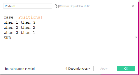
5. Bar chart
Finally, I wanted to show the podium results. I’d toyed with adding in an image and then it dawned on me…the podium is basically a bar chart! So I added in a bar chart to show the three medal winners. I will admit I had to get a bit creative on the bar chart to invert the rank. First position (rank=1) needs to be the biggest bar, so I cheated by adding in a case statement to reverse the rank.
The last step was to add a dashboard highlight action so that the user could hover over an athlete and easily spot their results in the other events…assuming they were in the top 10 of course!

What’s Next?
Next week we’re onto P and as I work for a company specialising in satellite technology, I’ve gone with a space theme and have picked Planets as our topic.
Keep your eyes peeled to see what Adam publishes next week on his blog and Tableau Public profile.
