
Lesson number one in collecting your own data…make sure you’re collecting the RIGHT data!
After spending several evenings collecting the data for my viz, I went back to the website to finish off and realised that the map showed a pin in Alaska instead of in the Arctic Ocean.
DAMN!!!
Instead of scrapping it and starting again, I decided to own my mistake though and create a viz about the daylight hours of North Pole, Alaska.
Viz Number One
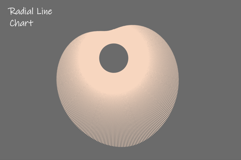
I’ve been looking for an excuse to try a radial line chart for a while now, so I’d set my heart on creating one to show the number of daylight hours for my viz. I followed a blog post by the Trig Kings themselves, the Flerglage Twins. I saw their talk at TC19 and they made trigonometry seem simple! I’d highly recommend it.
Once I’d created the viz, I just had to create the time difference calcs to show the length of time in hours and minutes for the tooltip.
Hours : FLOOR(SUM([Time end]-[Time start])*24)
Mins : ROUND((SUM([Time end]-[Time start])*1440)-([Duration (hours)]*60))
I quite like this viz – I think it kind of looks like a heart…but I’d collected data about daylight, night and twilight times, so I wanted to incorporate them somehow.
Viz Number Two
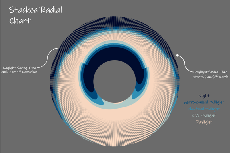
I knew that this wouldn’t be a simple viz to create though…after all, the radial line chart is just that…a LINE chart! So I knew I needed to create something that looked like a bar, without actually being a bar.
Luckily for me, I’m not the first to want to try this. And even luckier for me, Luke Stanke wrote an excellent blog to explain just what to do.
Now I love this view, but it looks a little bit strange when the clocks change so I added labels to highlight it and explain what was going on to the viewer.
I couldn’t decide which of these views I preferred, so I decided to try a few more styles and show a few different options for visualising this data.
Viz Number Three

The Stacked Radial Chart looks like a bar chart that has been curved around a circle, so I wanted to create a flat stacked bar chart to show the difference. This is what was used on the timeanddata.com website and I loved it. It made the data more digestible than a list of times. Again, I added the labels to show the clocks changing and added the hours and minutes on the tooltip.
I like a stacked bar chart, but it can be difficult to see the trends of individual phases. So next up was a simple line chart (thanks to Lorna Brown for the suggestion!)
Viz Number Four

I needed to restructure the data for this view to include zeros for missing data. Otherwise, it’s a simple line chart!
Finally, I love seeing calendars in Tableau. It’s one of the first things I learnt how to build, but had only ever displayed one month at a time.
Viz Number Five
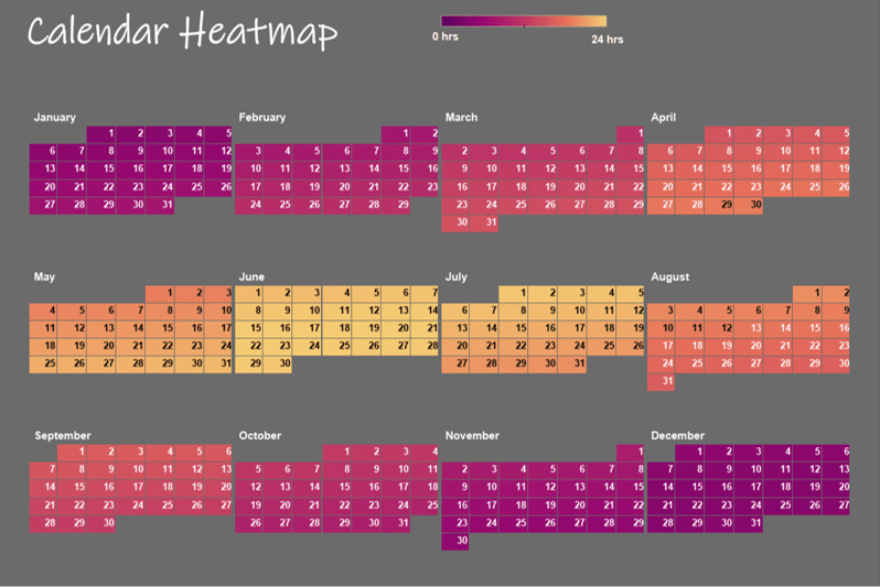
It would have defeated the purpose of this viz if I’d only shown one month at a time and I found a great blog post by Hanna Nykowska that showed how to get a 12 month calendar into one view. I had to tweak it slightly to get four columns, but otherwise, the steps were really easy to follow and I really liked the trick of using row and column dividers to create the space between months.
Home Page
The last thing to do was to pull them all together. I wanted to highlight all five vizzes on one page and allow the user to select one to explore so I used images of each dashboard as navigation buttons.
The trouble is, I also wanted to have a map to show where North Pole is and have a bit of a blurb about the city. I was playing with the layout when I remembered collapsible containers! They are a great way to add extra detail for the user to find and explore. I changed the images to expand or collapse the container to match my colour scheme and added a call out to it in the blurb under my dashboard title.
I’ve not shown all of the tabs on Tableau Public because I think it takes a bit of the magic away and adds a bit of clunk to the overall look.
I’m quite pleased with this workbook and I learned a lot along the way! So thank you to the amazing #datafam for writing up such excellent blogs that I could follow.
What’s next?
It’s over to Adam for next week’s choice! I can’t wait to see what he’s got in store, so be sure to keep your eyes peeled on his Tableau Public profile and his blog to see what he creates.
